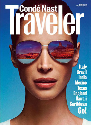
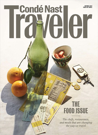
Condé Nast Traveler
A refresh of the Traveler logo. The lowercase x-height was slightly reduced and all the forms have been redrawn so they look more typographic and a bit more elegant. The lowercase r has a slightly different beak from the original. “Condé Nast” as also redrawn.
![](https://www.terminaldesign.com/wp-content/uploads/2017/02/traveler-758x470.png)
![](https://www.terminaldesign.com/wp-content/uploads/2017/02/traveller-05.jpg)
![](https://www.terminaldesign.com/wp-content/uploads/2017/02/traveller-04.jpg)
![](https://www.terminaldesign.com/wp-content/uploads/2017/02/traveller-02.jpg)