VF Sans Condensed
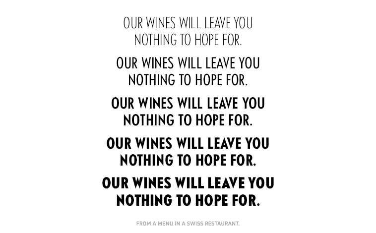
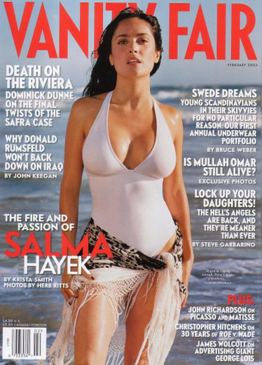
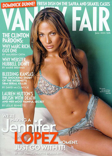
A geometric sans in five weights and two widths with corresponding obliques. Created for Vanity Fair magazine. Designed to have characteristics of 1930s transportation faces, but following no particular model. The face is used widely throughout the magazine, particularly in all caps on the cover.
David Harris | Design Director
Greg Mastrianni | Art Director
BUY FONT »


